
July 26, 2026
How to Prepare Print-Ready Artwork: A Checklist for Dayton Businesses
Before you send a brochure, banner, sign, or business card to print, use this practical checklist to catch the file issues that most often affect quality and timing.
By Print Wave
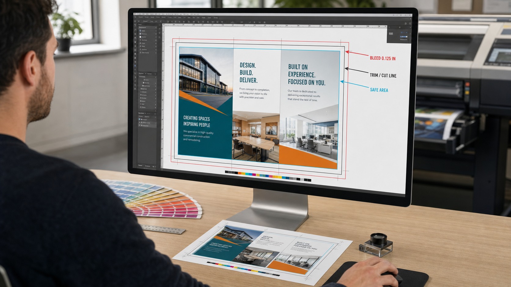
A print-ready file should match the final product size, include the required bleed, use sharp images and vector logos, preserve fonts, and clearly identify any important color requirements. Taking a few minutes to check those items before submitting artwork can prevent avoidable proof revisions and help your Dayton-area print project move into production with fewer surprises.
This checklist works for common business printing such as brochures, business cards, postcards, banners, yard signs, and event graphics. Product requirements vary, especially between close-view paper pieces and large-format graphics, so confirm the final specifications with your printer before exporting.
1. Set the document to the finished size
Start with the actual trim size or finished dimensions of the product. A business card, folded brochure, four-foot banner, and vehicle graphic all require different document setups. Designing at the final size makes it easier to evaluate image resolution, margins, fold placement, and type size accurately.
For oversized graphics, your print provider may ask for artwork at a specific scale, such as half size or one-tenth size. If you work at scale, name the scale clearly when you submit the file. Never assume the production team will infer it from the design.
2. Add bleed and protect the safe area
Bleed is artwork that extends beyond the final cut line so color reaches the edge after trimming. Many commercial paper products commonly use one-eighth inch of bleed on each side, but the correct amount depends on the product and production method. Ask for the exact template before building the file.
Keep logos, phone numbers, QR codes, and other essential content comfortably inside the cut line. The safe area matters because trimming and finishing have normal production tolerances. On folded pieces, also check that important content does not land directly on a fold.
3. Check image resolution at final size
An image can look sharp on a screen and still print soft. For most close-view digital and offset printing, 300 pixels per inch at final size is a common target. Large-format work may use a lower effective resolution because it is viewed from farther away.
Upscaling a small web image does not create missing detail. Check the effective resolution after every image has been placed and scaled in the layout. Our guide to understanding print resolution explains why viewing distance and final size change the requirement.
4. Use vector artwork for logos and line graphics
Vector files keep edges clean at any size, which makes them the right choice for logos, icons, type-based graphics, and line art. Common vector source formats include AI, EPS, and SVG, while a properly exported PDF can preserve vector information.
PNG and JPEG files are raster images. They can work well for photographs, but a small raster logo may become jagged when enlarged for a banner, sign, or wall graphic. If you only have a low-resolution logo, mention that early so there is time to discuss artwork options before the production deadline.
5. Prepare fonts and export a dependable PDF
Missing fonts can change line breaks, spacing, and the overall appearance of a design. Embed fonts in the exported PDF, outline display type when appropriate, or package the source file with the fonts and linked images if the production team needs an editable file.
For most finished artwork, a high-quality print PDF is a dependable handoff because it preserves the page geometry, fonts, images, and vector elements. Review the exported PDF itself rather than assuming it matches the design application. Zoom in, check every page, and confirm that nothing shifted or disappeared.
6. Review color with the final material in mind
Screens emit light, while printed materials reflect it, so an on-screen color is not a promise of an identical printed result. Convert or prepare artwork for the requested print workflow, identify brand-critical colors, and tell the printer when a specific color match matters.
Material also changes perception. The same artwork can look different on uncoated paper, gloss stock, corrugated plastic, banner vinyl, or window film. A physical or printed proof may be worthwhile when color, small type, folds, or finishing details are especially important.
7. Design for the way the piece will be used
Good file setup is not only technical. It should reflect the viewing distance, environment, and amount of time the audience has to read the piece.
- Keep outdoor banners and yard signs simple enough to understand at a glance.
- Use comfortable type sizes and contrast for brochures and other close-view pieces.
- Leave room around QR codes and test them from a printed proof.
- Confirm folds, drill holes, hems, grommets, and mounting areas before finalizing the layout.
- Avoid placing important content where hardware, seams, or finishing may cover it.
Dayton-area businesses often need print for trade shows, school events, seasonal promotions, construction sites, real estate listings, and service vehicles. Outdoor pieces also have to account for wind, rain, sunlight, and installation conditions. Those practical details can affect the right material and finishing method, not just the artwork dimensions.
Final preflight checklist
Before uploading your artwork, review this short list:
- The document uses the correct finished size or clearly states its scale.
- Bleed extends beyond every trimmed edge where required.
- Important text and logos stay inside the safe area.
- Images are sharp at their effective printed size.
- Logos and line art remain vector whenever possible.
- Fonts are embedded, outlined, or packaged correctly.
- Brand-critical colors and material expectations are documented.
- Folds, finishing, hardware, and installation areas are accounted for.
- The exported PDF has been reviewed page by page.
- The filename clearly identifies the project and version.
What to send with your quote request
Along with the artwork, include the finished size, quantity, material or intended use, single- or double-sided printing, preferred completion date, and any finishing or installation needs. Those details help us recommend the right production path and provide a more accurate quote.
You can explore Print Wave options for business cards, folded brochures, and custom banners in Dayton. You can also see examples of our work before planning your project.
When your file is ready, request a print quote and attach the artwork you want us to review. Print Wave serves businesses from our Centerville production location at 97 Compark Road and throughout the Dayton area.
Frequently Asked Questions
What is the safest file format for commercial printing?
A properly exported print PDF is usually the most dependable handoff because it can preserve page size, fonts, images, and vector artwork. Product-specific requirements still apply, so confirm the requested preset and bleed before exporting.
Does every printed product need bleed?
No. Bleed is needed when artwork must print to a trimmed edge. Products without edge-to-edge color may not need it, while banners, signs, and specialty finishing can use different allowances.
Can Print Wave review artwork before production?
Yes. Include the finished size, quantity, material, deadline, and source file with your quote request. We can identify visible production concerns and quote any file-preparation work before it begins.